Holding my breath
This article contains graphics some readers may find distressing.

Anyone with an eye on the news this week has seen a variation of this plot. We know its shape well by now, and its peak grows each day. But like me, you may have been more affected by the images captured in the streets, hospital waiting rooms, and homes of people around India as they face a uniquely horrifying ordeal. If you or your loved ones have been touched by this crisis, my heart goes out to you.
The urgency of the situation is lost on no one. As the country faces a “second wave” of coronavirus outbreaks that began in late March, a strained healthcare system and dwindling oxygen supplies have made surviving infection even more difficult, especially for those with the fewest resources.
It is popular to quantify this pandemic by reporting the number of cases and fatalities from the virus in an area for a certain time period, and these are both crucial measures of outbreak severity. But though people diagnosed with COVID-19 face diverse outcomes from a false positive test result to severe illness, death represents a singular and incalculable loss. Therefore, I have chosen to illustrate the latter through data visualisation.
Inspired by the New York Times’ Wall of Grief, this flowing scatterplot shows the number of people who have died from COVID-19 in India daily from February 1st this year. The total figure will soon pass 68,000.
The placement of points within each date is random. Scrolling down the visualisation reveals their increasing density, and beginning in mid-April, the dots become nearly indistinguishable.

Tragedy can be witnessed as a series of statistics or as individual stories of grief, anger, and longing. Both perspectives are important, though they are difficult to reconcile. Applying this style of visualisation design to a shorter time period to capture rapidly altering national circumstances, while leaning towards a quantitative birds-eye-view approach, borrows elements from both.
COVID-19 has disproportionately impacted the less privileged and those without the relative luxury to remain at home for extended periods of time. Its victims may have been known to many or to only a few. But here, each loss is equally visible, and each bears equal weight. Designing this visualisation made me reflect on each life that has been taken, as well as the many losses that are not documented. I hope it does the same for you.
I know these words and figures are empty without action.
Here are a list of organisations and initiatives that are saving lives and links to give to their causes:
- Feeding India (procuring oxygen for patients)
- Hemkunt Foundation (procuring oxygen cylinders)
- Give India (procuring oxygen concentrators and cylinders, ventilators, and BiPAP machines)
- Akshaya Patra (distributing meals and grocery kits to daily wage and migrant workers, construction workers, and residents of nursing homes)
- Khalsa Aid (procuring oxygen concentrators for patients; more information on social media)
As always, please vet each source before donation.
Thank you so much for reading, and I wish you and yours the best of health. If we know each other, I can always provide a listening ear as we weather this storm.
Appendix: Method of creating the above visualisation
In the style of this New York Times graphic, I used the free software Flourish and Google Sheets to create the grouped scatterplot above.
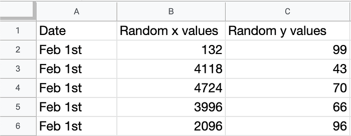
First, I collected data about the number of daily deaths from COVID-19 in India from the Johns Hopkins University Coronavirus Resource Center GitHub page. After storing these figures on a different sheet, I generated random “x” and “y” values between 1–10000 and 1–100 respectively to determine the positioning of each dot. My choice of these number ranges was arbitrary, but I ensured the former was large enough as to “appear random” (e.g. without noticeable vertical lines). I added one row for each death and grouped rows by date as shown below.

I then used the “grouped scatterplot” template on Flourish to generate one dot for each life lost and made some modifications to the plot to add headers, footers, and labels. I would welcome suggestions and critiques on my method and result!
Scrolling through this data, all 57,000 rows of it, was enough to make me catch my breath. I can’t imagine how my diluted grief compares to those who have lost someone close to them.


